Blog Section
Visualizing US Inflation Outliers with Events
Introduction
This blog demonstrates how to analyze time series anomalies using visualization tools and event tables.
Process Overview
Using monthly US inflation rates as a case study, navigate to the experimental page via the header menu:

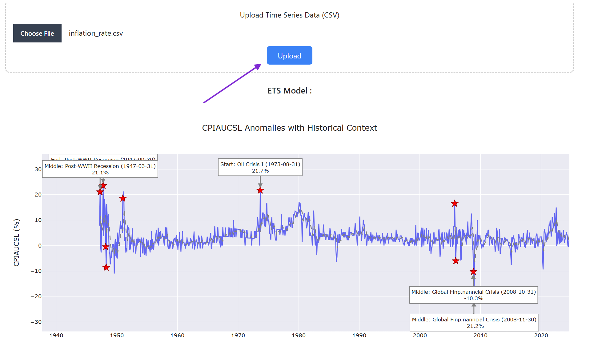
This page enables visualization of outliers based on an optimal ETS model selected by BIC criteria. For demonstration purposes, full sample fitting is employed to identify and examine historical anomalies.
Upon uploading the data in the top panel, the interface displays a time series plot with predictions and associated events:
Anomaly Analysis
Setting the outlier threshold to 4.5 identifies four significant anomalies at 2008-11, 1948-03, 1973-08, and 1947-09. These dates represent periods of exceptional inflation volatility that deviated substantially from model predictions.
Event Context
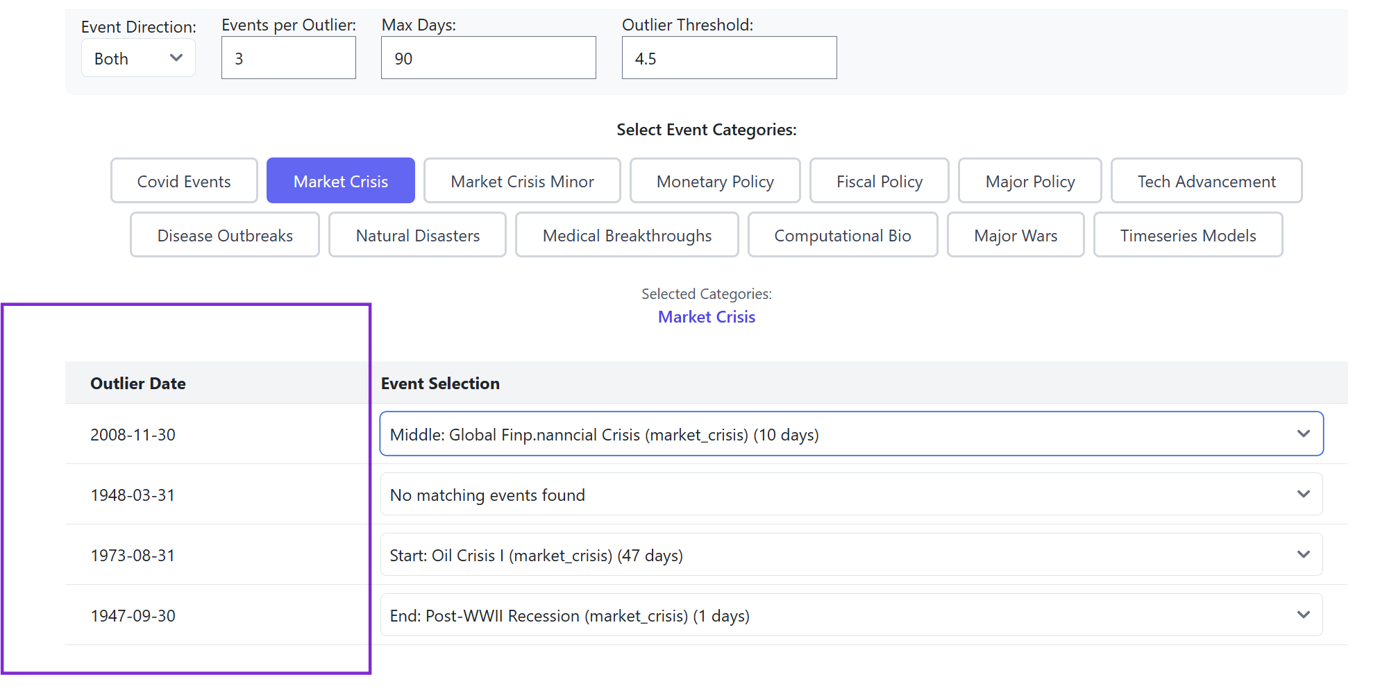
To contextualize these anomalies, relevant event tables can be overlaid with the time series data. Selecting the market crisis event table reveals historical events coinciding with three of the four outlier dates (within the default 90-day window specified by the Max Days Parameter).
Analysis Results
This visualization reveals clear patterns:
- The 1947 anomaly coincides with the post-war recession, marked by a historical negative inflation rate of approximately -10%
- The 1973 fluctuation aligns with the Oil Crisis triggered by the oil embargo
- The 2008 anomaly corresponds to the Great Recession
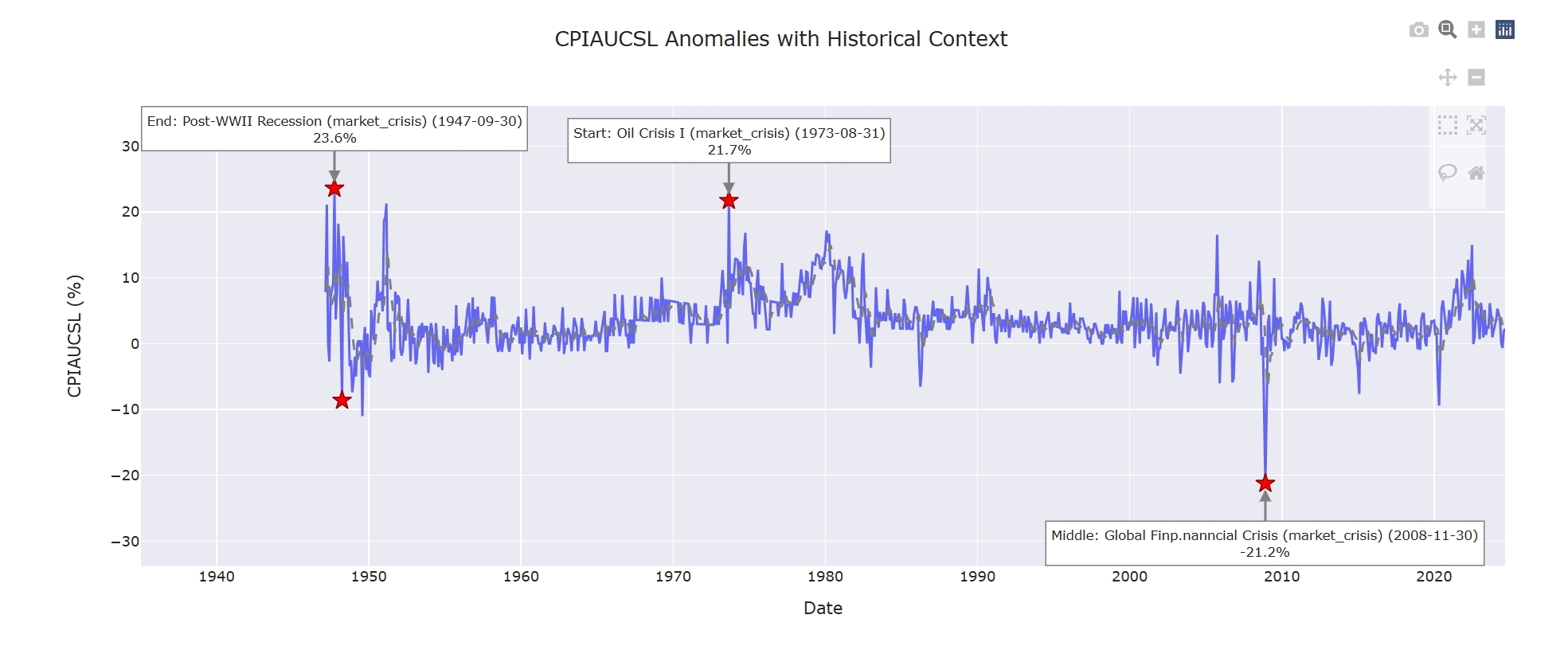
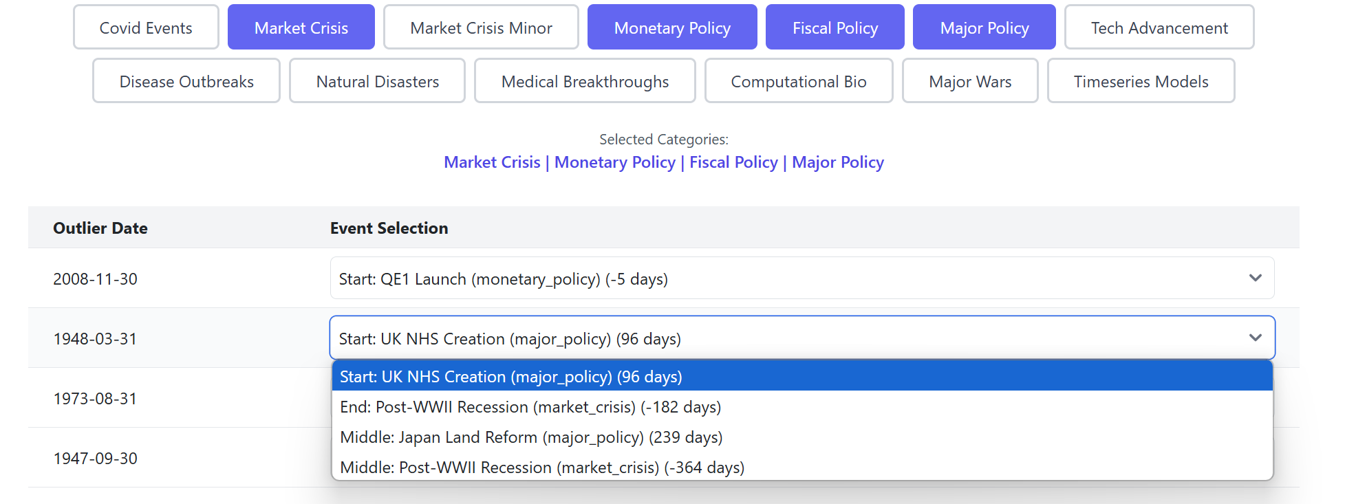
To enhance the analysis, incorporating Monetary Policy events and extending the Max Days Parameter to one year provides additional context:
1. The Federal Reserve's response to the 2008 Lehman Brothers collapse is evident through the initiation of the first Quantitative Easing program
2. The extended time window reveals additional relevant events for previously unexplained outliers
Conclusion
While the creation of the UK NHS appears in the timeline, it is unlikely to explain the 20% inflation spike. Further investigation through the event selection dropdown suggests that the 1947 inflation anomaly is more closely related to the post-WWII economic transitions in the United States.
This analysis is corroborated by historical records, which indicate that the removal of price controls and supply constraints following WWII contributed to the 1947 inflation spike (Source).
This demonstration illustrates the effectiveness of combining time series visualization with event mapping to rapidly identify and explain data anomalies, providing valuable insights for feature engineering and historical analysis.